Icons
Visual communication can be essential in scanning and understanding for populations whose first language may not be English. Please be sympathetic with the goal of cohesion and don’t use an icon for a purpose it was not intended for.
On this page
Overview
Consistent iconography in any user interface is critical to creating a product that is highly accessible across all different levels of literacy. Icons may need to be localized for different cultures and languages.
Good icons use simple, graphic shapes so they can be understood even at a small size. They have little detail. They are as universal as possible, consistent with other platforms.
Primary vs Secondary Icons
Primary icons are used for navigation or interaction. Primary icons are interactive, they change the surround environment or data. They likely don’t need to be coupled with text.
Secondary icons provide clarity. Secondary icons are used before text to communicate topical information.
Most of HQ's icons come from FontAwesome. All icons in FontAwesome are already built into HQ. Other icons have been custom created for HQ.
Common FontAwesome primary icons
<i class="fa-solid fa-plus"></i>
<i class="fa-solid fa-remove"></i>
<i class="fa-solid fa-search"></i>
<i class="fa-solid fa-angle-double-right"></i>
<i class="fa-solid fa-angle-double-down"></i>
<i class="fa-regular fa-trash-can"></i>
Common FontAwesome secondary icons
<i class="fa-solid fa-cloud-arrow-down"></i>
<i class="fa-solid fa-cloud-arrow-up"></i>
<i class="fa-solid fa-triangle-exclamation"></i>
<i class="fa-solid fa-info-circle"></i>
<i class="fa-solid fa-question-circle"></i>
<i class="fa-solid fa-check"></i>
<i class="fa-solid fa-external-link"></i>
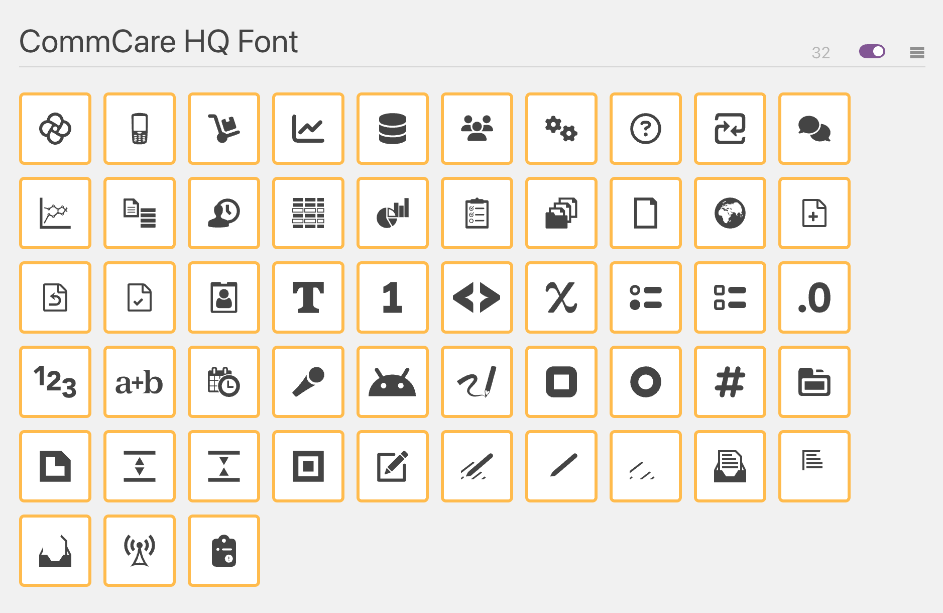
Custom Icons
HQ has its own set of icons custom created to communicate HQ-specific concepts. The majority of these icons are found in App Builder and Form Designer.
Custom HQ icons
<i class="fcc fcc-flower"></i>
<i class="fcc fcc-applications"></i>
<i class="fcc fcc-commtrack"></i>
<i class="fcc fcc-reports"></i>
<i class="fcc fcc-data"></i>
<i class="fcc fcc-users"></i>
<i class="fcc fcc-settings"></i>
<i class="fcc fcc-help"></i>
<i class="fcc fcc-exchange"></i>
<i class="fcc fcc-messaging"></i>
<i class="fcc fcc-chart-report"></i>
<i class="fcc fcc-form-report"></i>
<i class="fcc fcc-datatable-report"></i>
<i class="fcc fcc-piegraph-report"></i>
<i class="fcc fcc-survey"></i>
<i class="fcc fcc-casemgt"></i>
<i class="fcc fcc-blankapp"></i>
<i class="fcc fcc-globe"></i>
<i class="fcc fcc-app-createform"></i>
<i class="fcc fcc-app-updateform"></i>
<i class="fcc fcc-app-completeform"></i>
<i class="fcc fcc-app-biometrics"></i>
<i class="fcc fcc-incomplete"></i>
<i class="fcc fcc-manage-case"></i>
Custom HQ icons specific to form builder
<i class="fcc fcc-fd-text"></i>
<i class="fcc fcc-fd-numeric"></i>
<i class="fcc fcc-fd-data"></i>
<i class="fcc fcc-fd-variable"></i>
<i class="fcc fcc-fd-single-select"></i>
<i class="fcc fcc-fd-single-circle"></i>
<i class="fcc fcc-fd-multi-select"></i>
<i class="fcc fcc-fd-multi-box"></i>
<i class="fcc fcc-fd-decimal"></i>
<i class="fcc fcc-fd-long"></i>
<i class="fcc fcc-fd-datetime"></i>
<i class="fcc fcc-fd-audio-capture"></i>
<i class="fcc fcc-fd-android-intent"></i>
<i class="fcc fcc-fd-signature"></i>
<i class="fcc fcc-fd-multi-box"></i>
<i class="fcc fcc-fd-single-circle"></i>
<i class="fcc fcc-fd-hash"></i>
<i class="fcc fcc-fd-external-case"></i>
<i class="fcc fcc-fd-external-case-data"></i>
<i class="fcc fcc-fd-expand"></i>
<i class="fcc fcc-fd-collapse"></i>
<i class="fcc fcc-fd-case-property"></i>
<i class="fcc fcc-fd-edit-form"></i>
Creating New Icons
If a suitable icon doesn't exist in FontAwesome or HQ's custom set, it might be necessary to create one and add it to our custom set of icons.
The instructions below assume you:
- Are familiar with vector graphics editing. If you aren't find someone who is.
- Have created a (free) account on IcoMoon and are logged in.
These instructions are friendly for non-developer designers all the way until the end of the "Generating the Updated Font" step. At this step you will download two files that you can then hand off to a developer to commit the changes.
Configuring Your New IcoMoon Account
If this is the first time signing into your free IcoMoon account, start here. With the free account, the font configuration is stored client side, so you need to upload the configuration file from HQ each time you want to work on the font.
You can find the configuration file at /corehq/apps/hqwebapp/static/hqwebapp/font/CommCare HQ Font.json.
In IcoMoon, go to "IcoMoon App" in the top-level navigation.

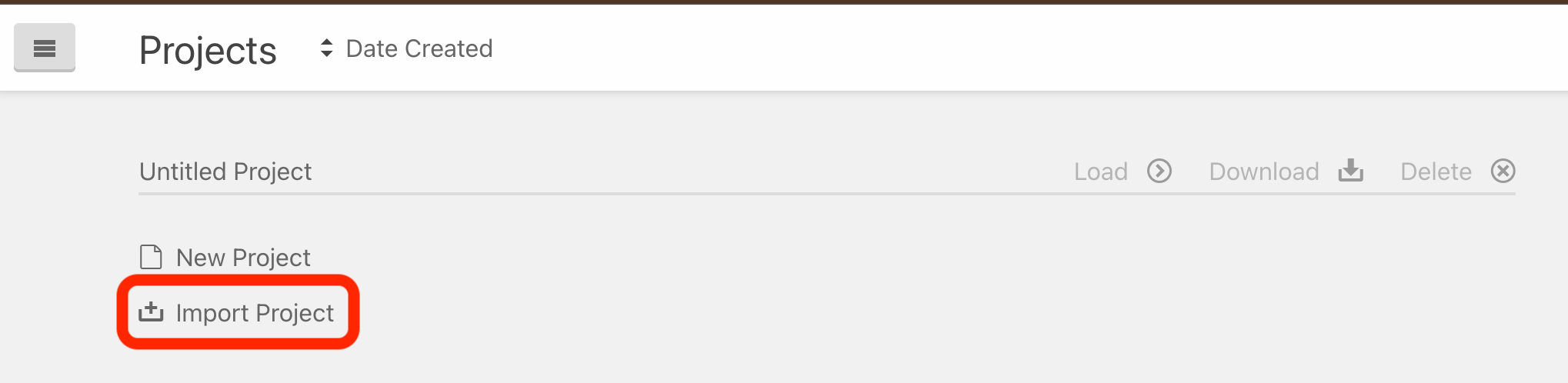
In the IcoMoon App, click on "Untitled Project" in the right-hand top-level navigation to enter "Manage Projects".

Then click on "Import Project".
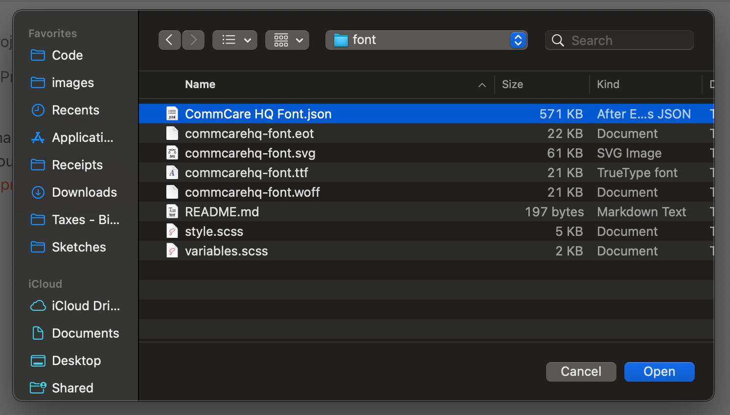
Select the CommCare HQ Font.json config file found in /corehq/apps/hqwebapp/static/hqwebapp/font/, and click "Open".
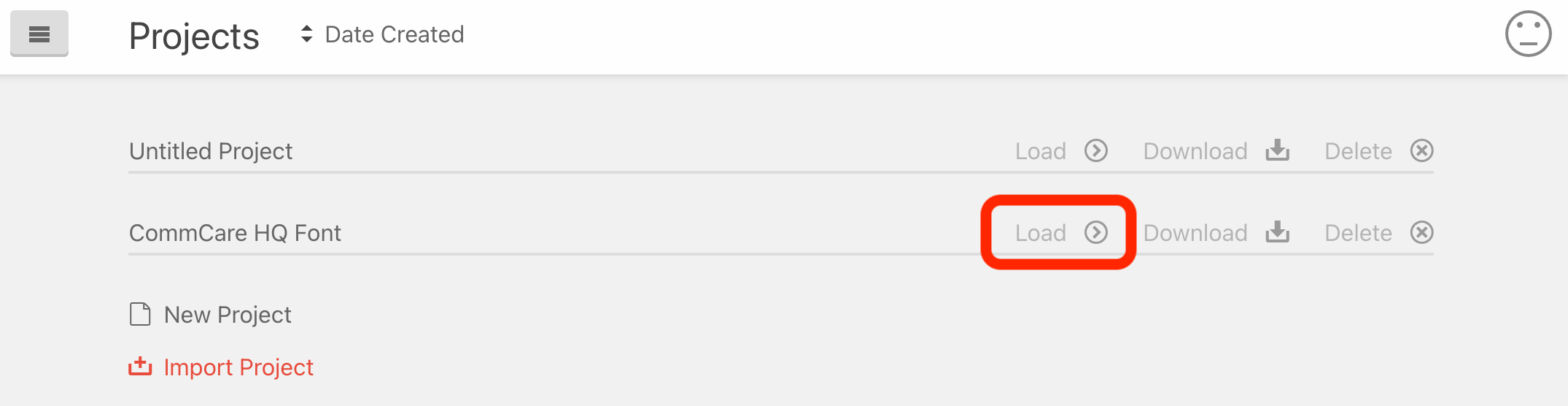
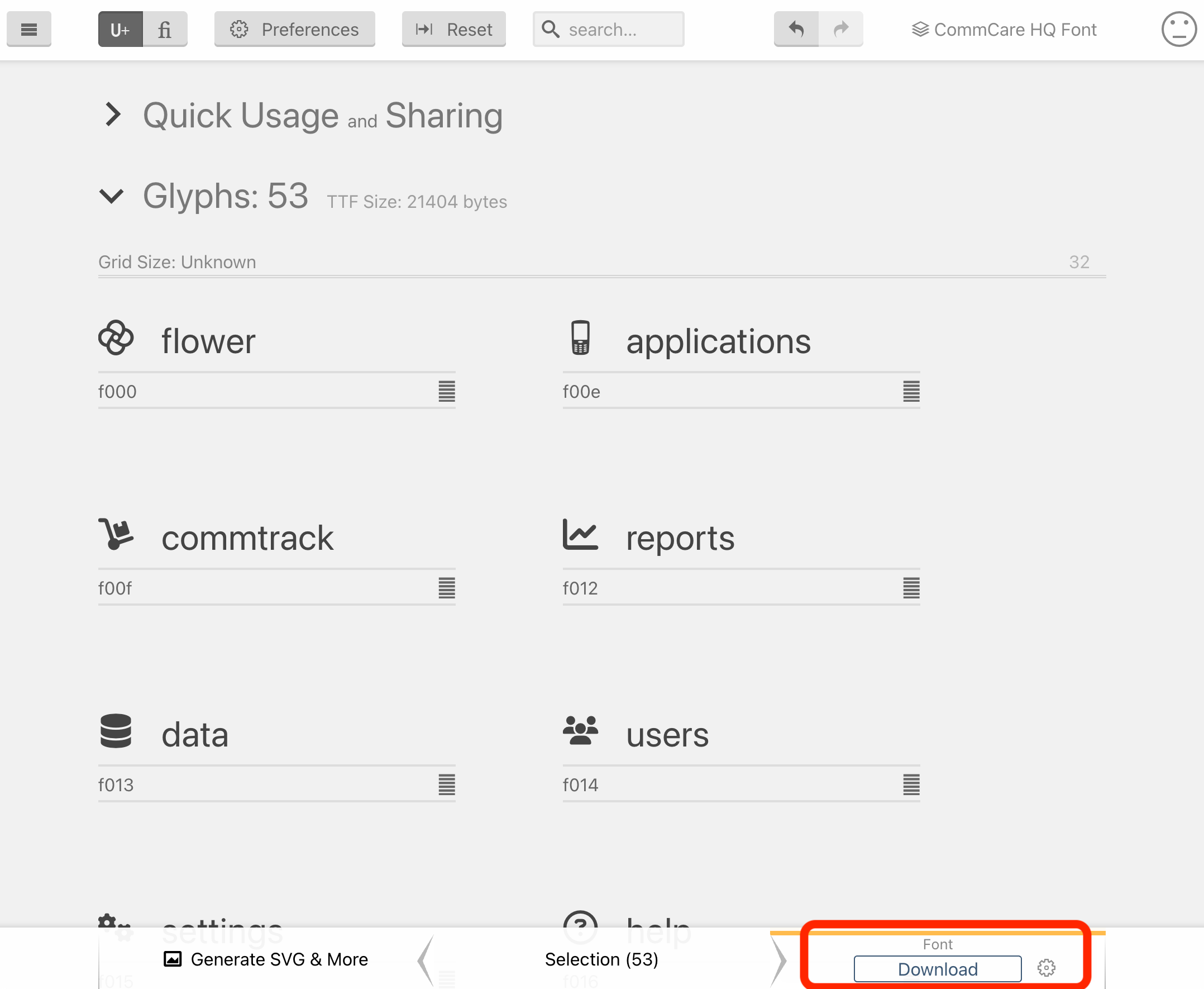
Then click on "Load" next to the "CommCare HQ Font" project to open the project.
Your IcoMoon App should now look something like the following:
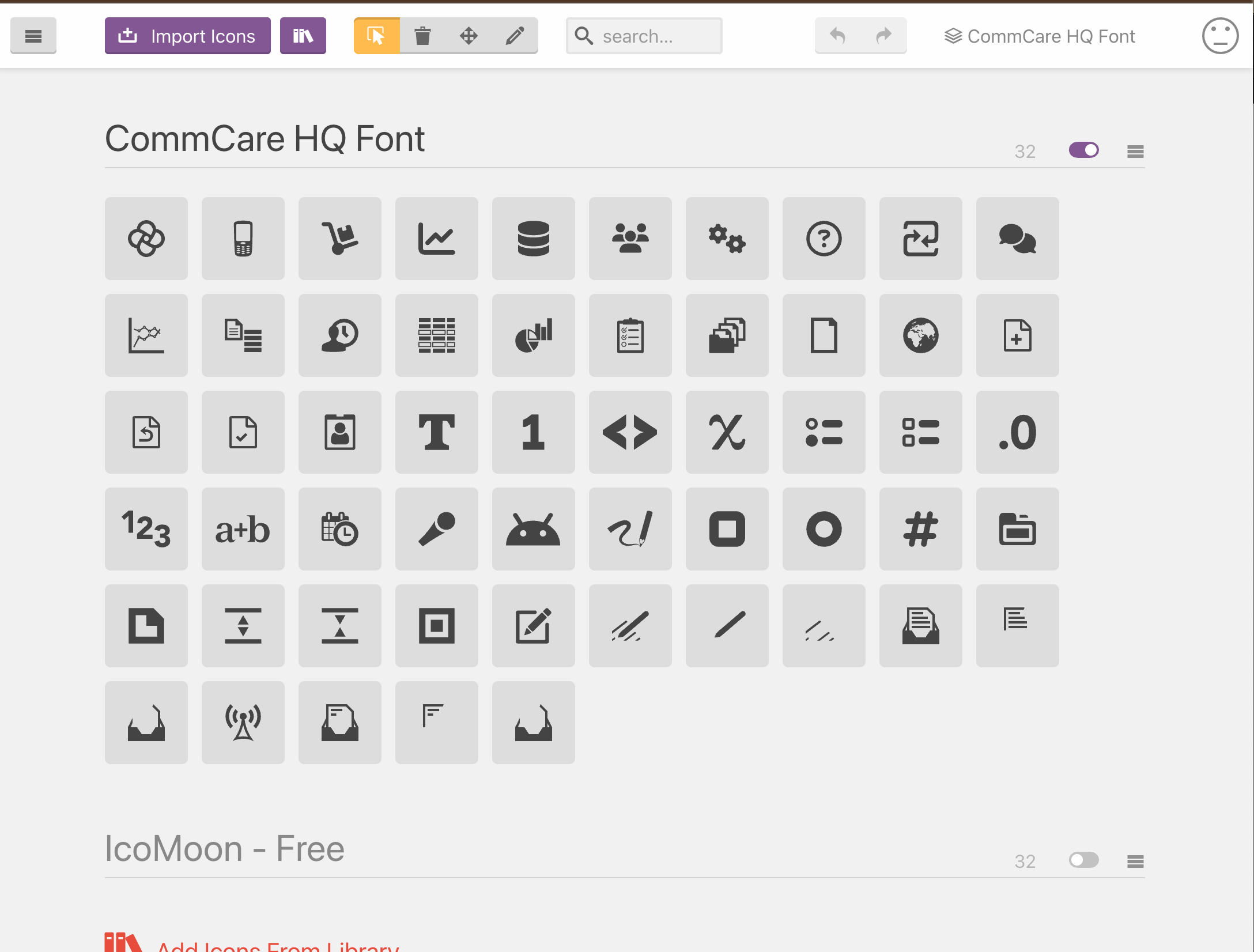
Note that the "IcoMoon - Free" icon set at the bottom is de-selected.
You can now move on to the step "Adding a New Icon".
Syncing Your IcoMoon Account
If you already have your IcoMoon account set up, but someone else has edited the CommCare HQ Font since you last edited the font,
please make sure you upload the latest CommCare HQ Font.json configuration to your IcoMoon app.
On your navigation bar, visit "CommCare HQ Font" to Manage Projects.

Click "Delete" next to CommCare HQ Font.
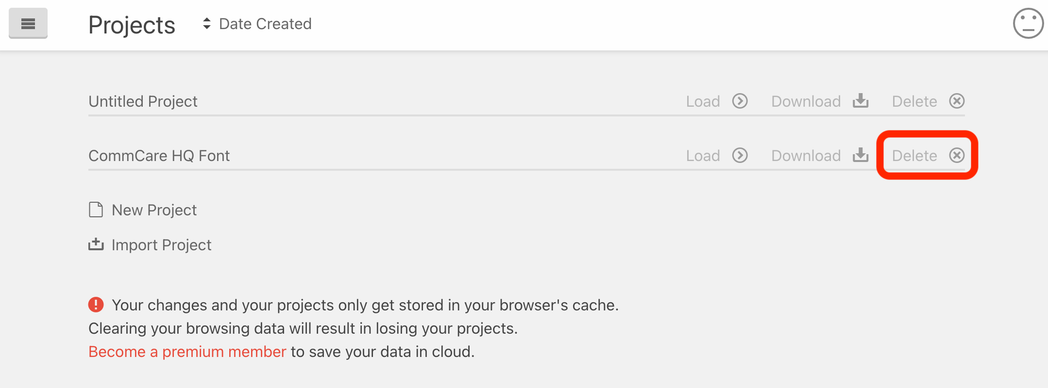
Then click on "Import Project".
Select the latest CommCare HQ Font.json config file found in /corehq/apps/hqwebapp/static/hqwebapp/font/, and click "Open".
Then click on "Load" next to the "CommCare HQ Font" project to open the project.
Your project should now be ready for the next step, "Adding a New Icon".
Adding a New Icon
To add a new icon, first click on the "menu" icon for the CommCare HQ Font and select "Import to Set".
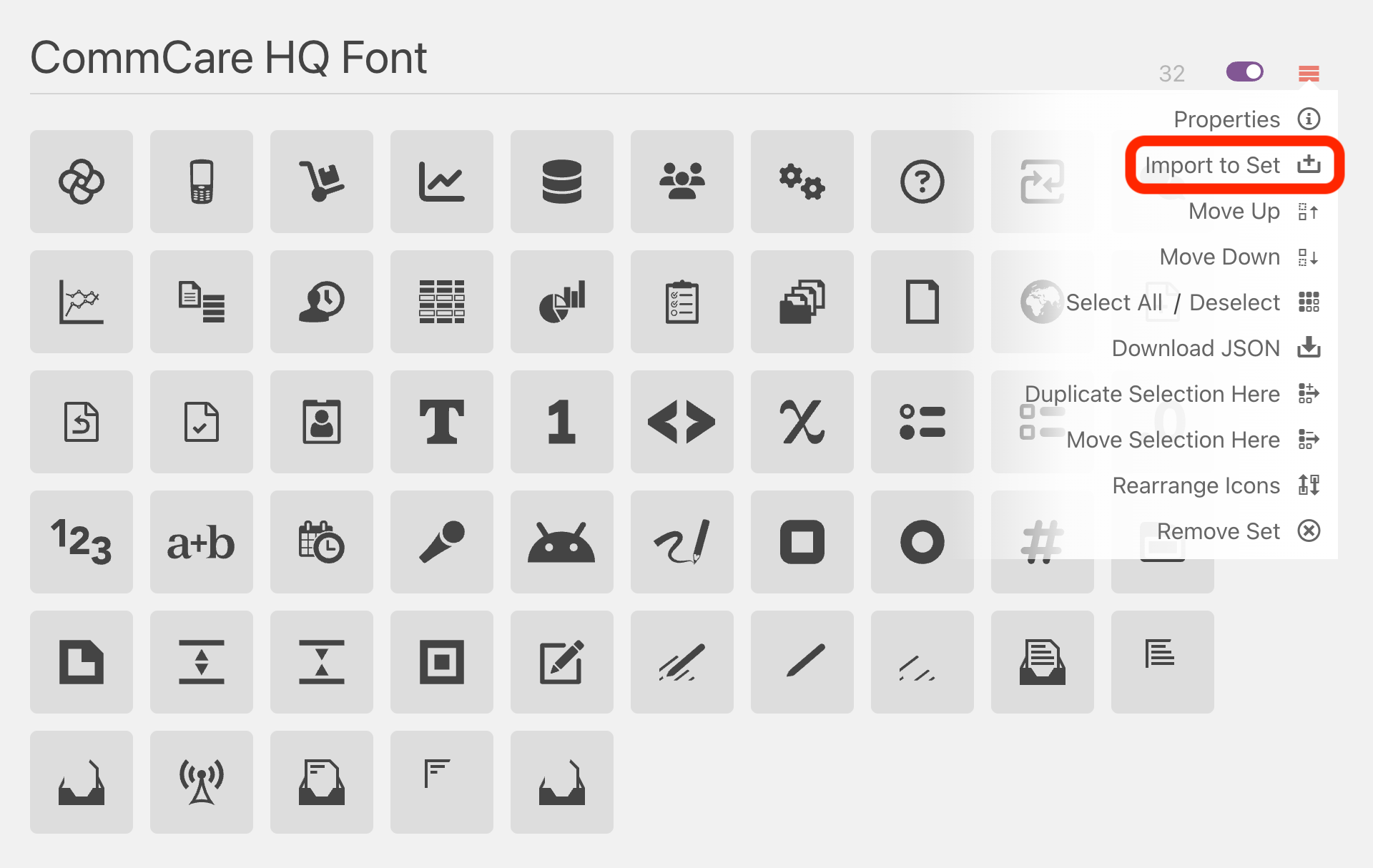
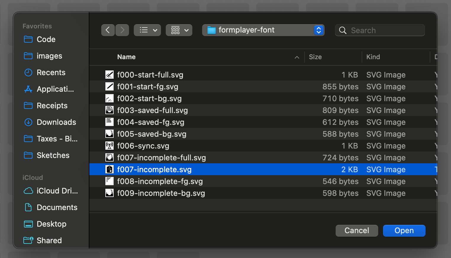
Then, choose your source SVG file to import.
Design Note: Your SVG should have an artboard / canvas size of 1024 px x 1024 px to match the other icons.
Here is an example SVG to use as a starting point. You can delete the CommCare flower from the SVG and paste your desired vector image.
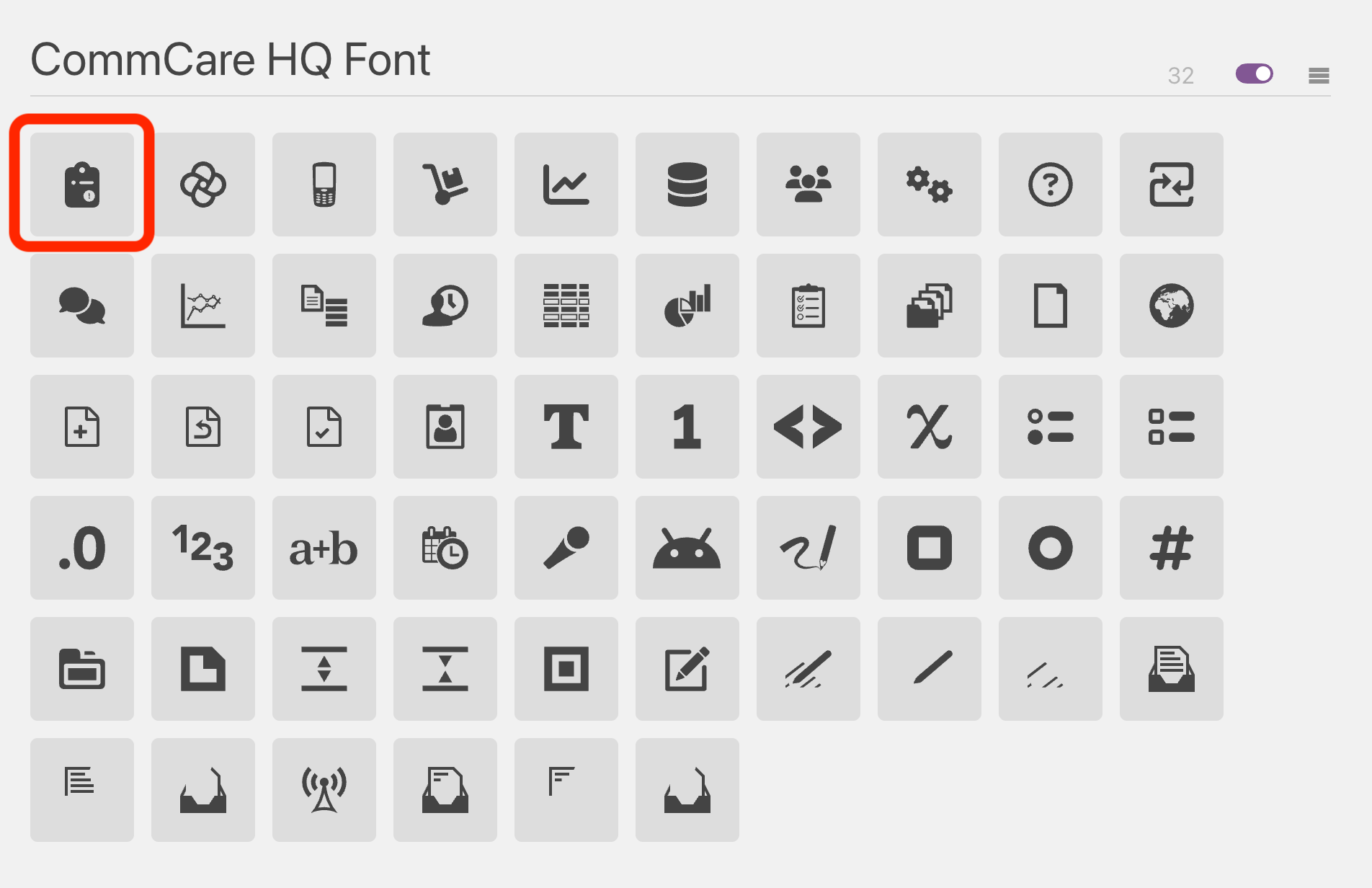
Once uploaded, your new icon will appear as the first icon in the list (before the CommCare "flower").
Please select the "move" tool in the top menu bar.

Then, click and drag the icon to the end of list (or different order, if needed).
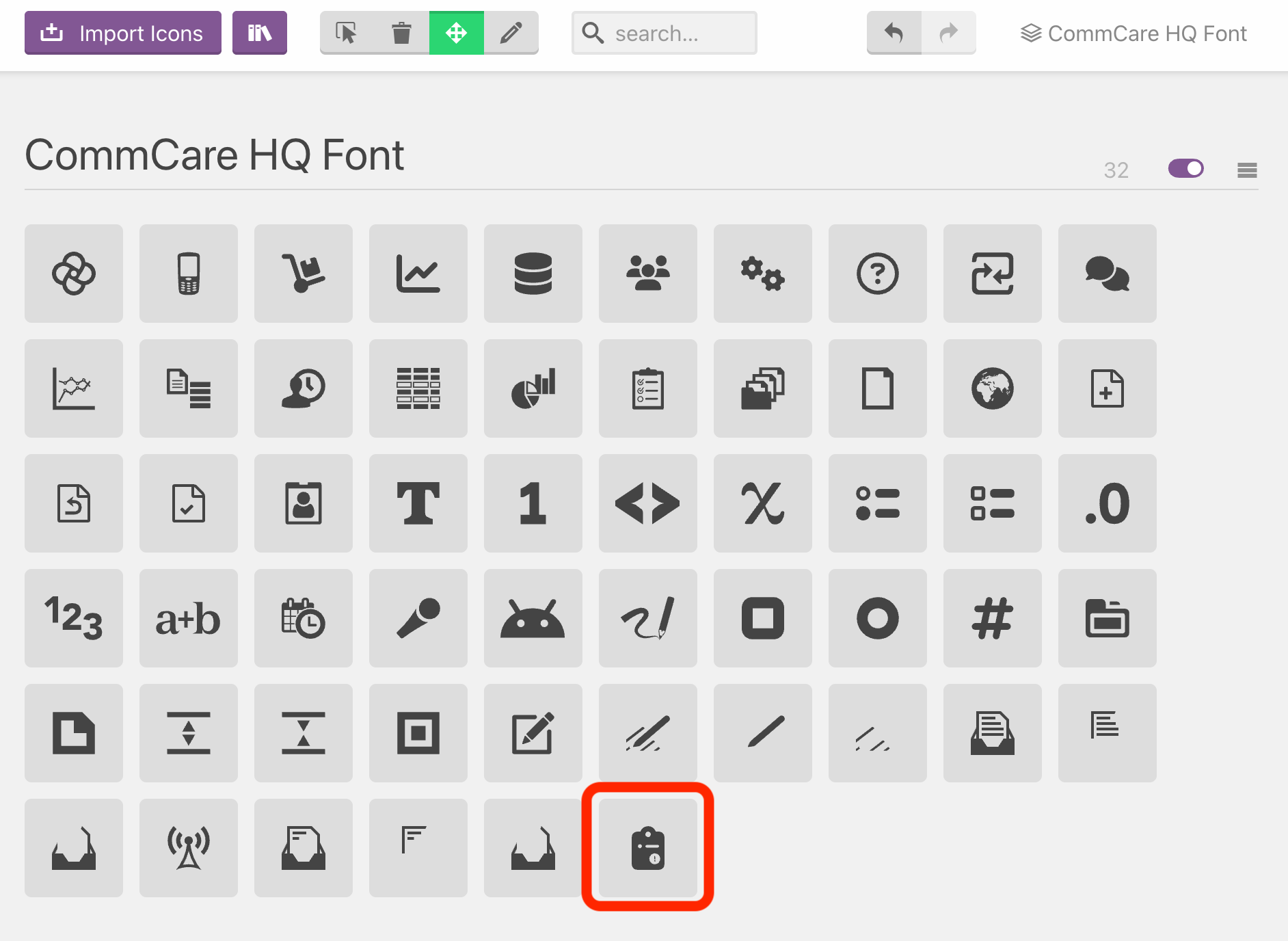
Edit the newly-added icon by selecting the "pencil" tool in the menu bar, and click on the icon to open the edit panel.

With the edit panel open, update the "Tags" and "Names" fields. The text in the "Names" field will
be the final css class name, prefixed with fcc-. In the image below, this new icon
can be used as <i class="fcc fcc-incomplete"></i>.
If you need to delete any icons as part of your update work, please proceed to the next step. Otherwise, proceed to "Generating the Updated Font".
Deleting Unused Icons
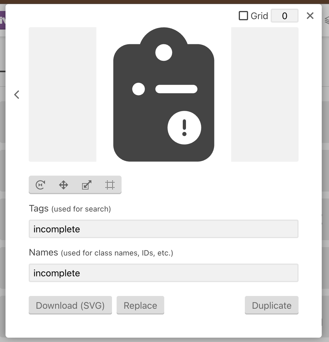
Sometimes it is necessary to remove unused icons. To do this, select the "delete" tool in the menu bar.

Then, just click on the icons you would like to delete. In this example, we delete the old incomplete forms icon from Web Apps.
IMPORTANT: It is recommended that after you delete icons, go back to the menu bar and select the "selection" tool (or any other tool), so you don't accidentally click and delete another icon.

Generating the Updated Font
To generate the updated font files needed to commit this change, first click on the "menu" icon next to CommCare HQ Font and select "Select All" to select all the icons.
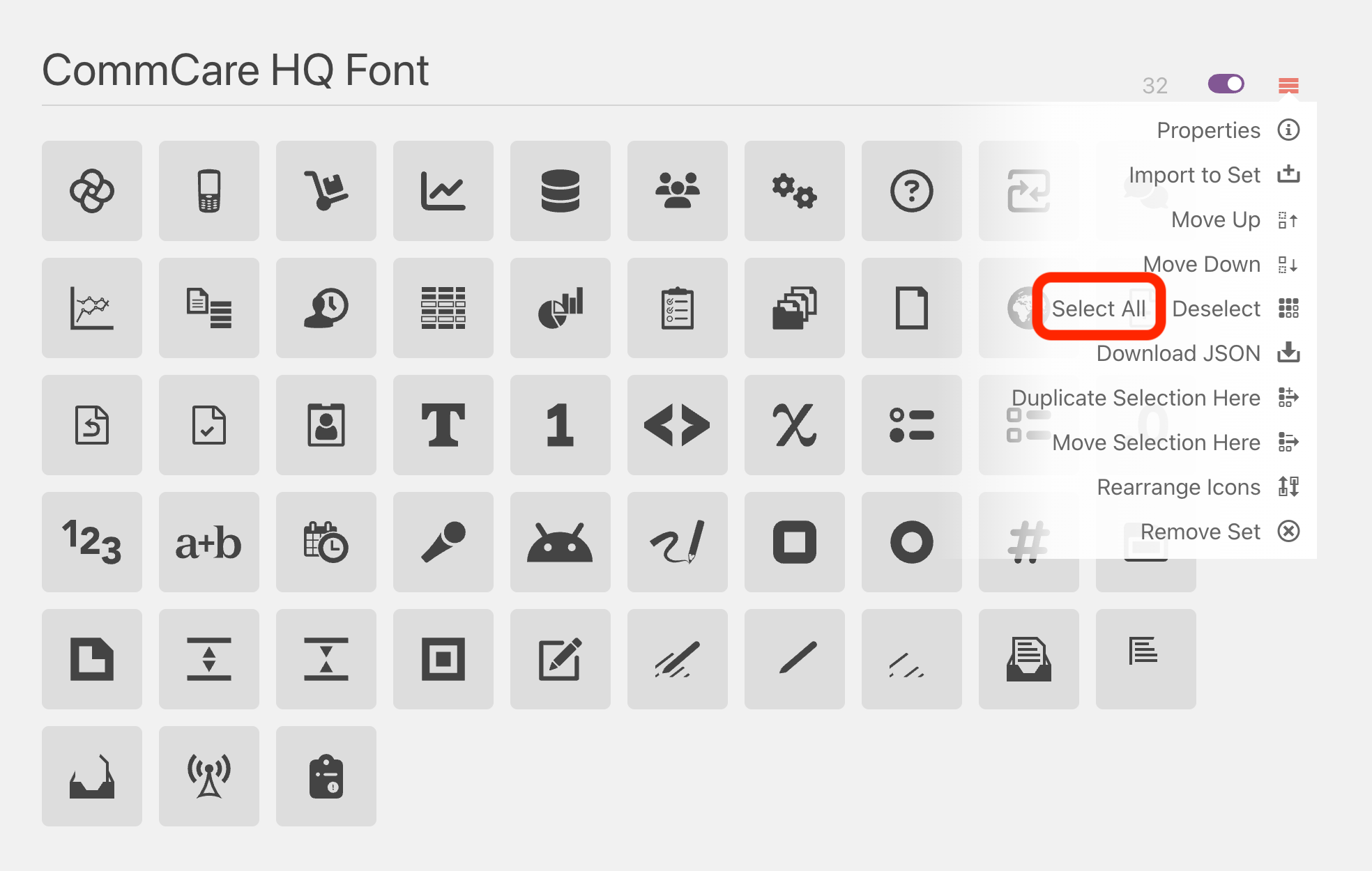
All icons in the CommCare HQ Font section should then be selected.
Then, click on "Generate Font" in the bottom menu bar.

This will take you to the next step where you can review all the icons that will be included in the font. You shouldn't need to touch anything here unless you are doing something very advanced. To proceed, click on "Font Download" in the bottom menu bar.
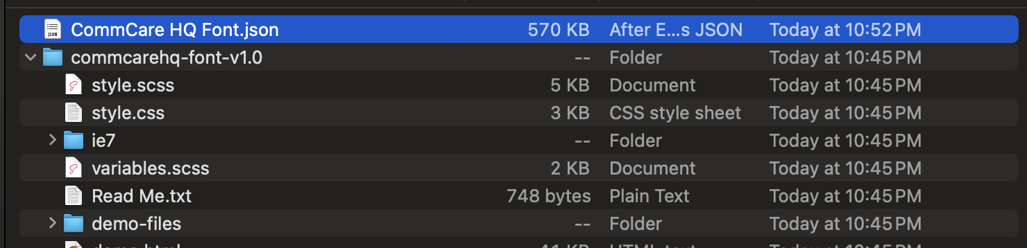
You will then download a zip file that looks something like commcarehq-font-v1.0.zip.
After this, you need to download the updated config for your IcoMoon app. To do this, navigate to the "CommCare HQ Font" / "Manage Projects" option in the top menu bar.

You can then clock the "Download" option. This will download a file that looks something like
CommCare HQ Font.json.

If you are a designer, please deliver the .zip and .json files you just downloaded
to a developer to proceed with the final steps.

Committing Changes
By this point, you should have the newly-generated .zip and .json files
from the previous section.
You can begin by copying CommCare HQ Font.json to corehq/apps/hqwebapp/static/hqwebapp/font/,
replacing the existing .json file there with the same name.
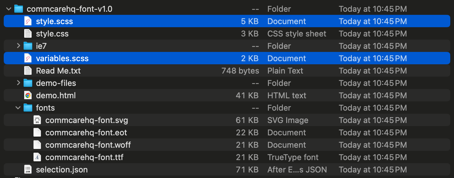
Next, unzip the .zip file and copy the font files shown below to the same directory,
corehq/apps/hqwebapp/static/hqwebapp/font/.
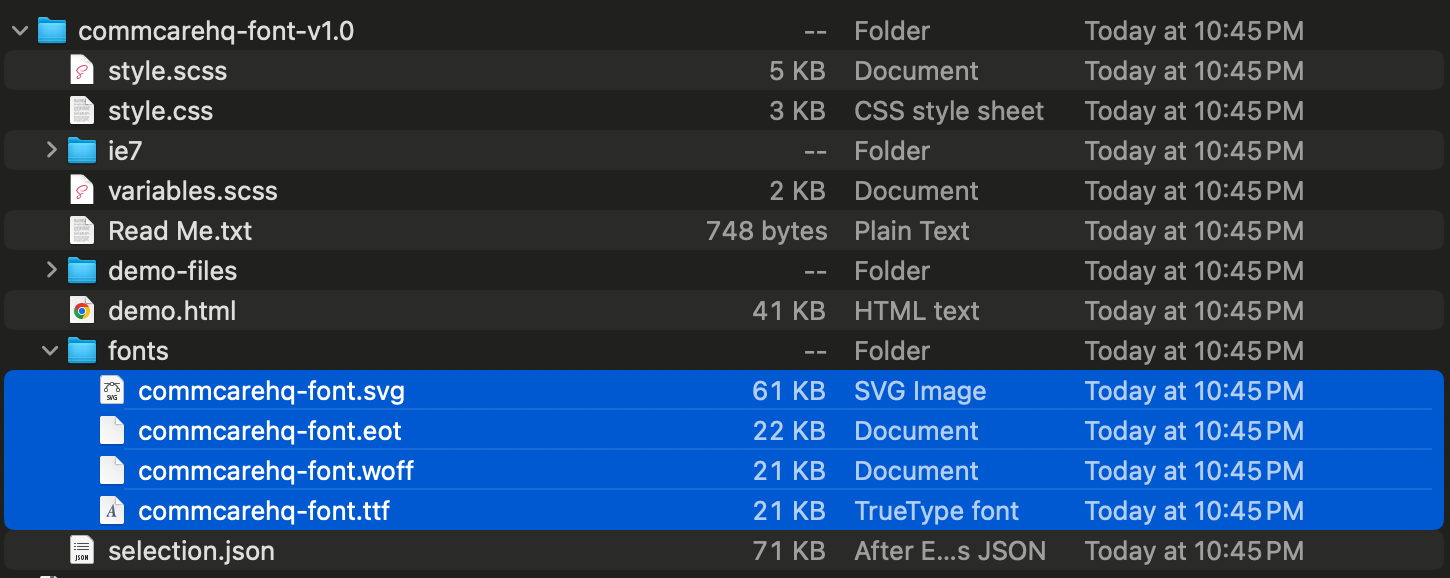
Then, copy the two scss files shown below to the same directory,
corehq/apps/hqwebapp/static/hqwebapp/font/. Please do not copy the CSS file. The only two
files copied should be style.scss and variables.scss.
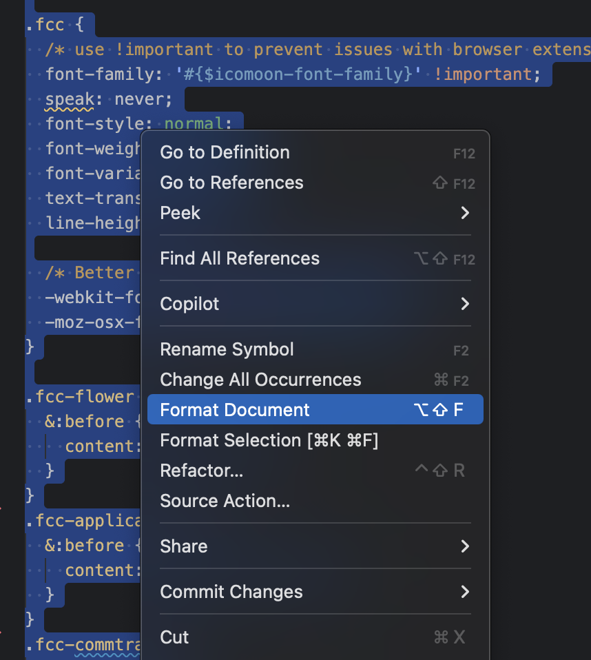
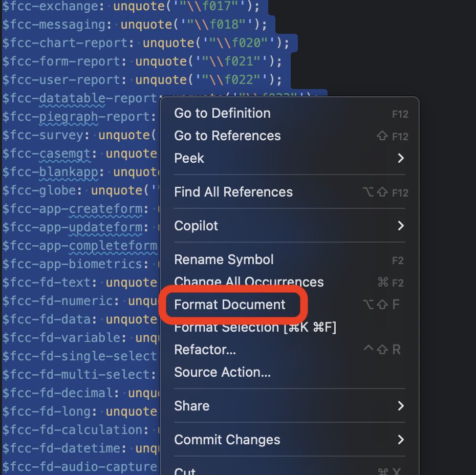
IcoMoon will insert a lot of trailing whitespaces in the scss, which your commit hook will likely yell about,
so it's recommended to open each copied scss file into your IDE and select "format", or manually
edit to remove those trailing whitespaces. The screenshots below show the workflow with VSCode.
Then, please make sure the change to the $icomoon-font-path in variables.scss is not committed.
In the screenshot below, this change is discarded using the VSCode diff UI.
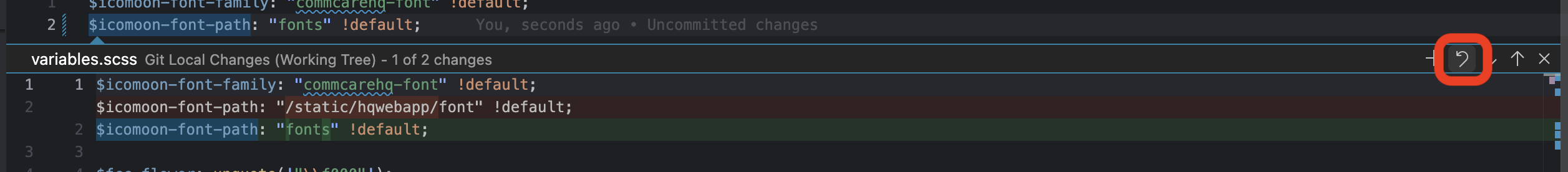
The font path should remain /static/hqwebapp/font, otherwise the commcare font will not load.
Commit these changes, and you are ready to go with your new icons! Please make sure to document the newly added icons on this page, and check that all the existing icons are also loading properly.